
Watch Congress Evolve in Two and a Half Minutes and See What My Class Entails
I rebuilt the classic Voteview animation of every member of Congress since 1789. Then I made some charts. Here's some PIG for you.

My favorite class to teach is POLS 302, Parties and Elections in the US. I am teaching it this fall. During an election. Anyway, yesterday and today, I was doing some prep for it. Basically, it’s an upper division course that covers elections and the three parts of political parties: party organization, party in the electorate, and party in government. (”PIG-PIE-PO” as I am sure my students tire of hearing.)
Well, here’s some of the PIG material for you. Along with some new visuals and a video!
Further, I figured with the PCSA markup coming Thursday, and some of my readers have been following along and reading my college athletics series, well, you suddenly care about Congress (we call this here a “teachable moment” in the biz) and you’ve now met the number 85.3 several times. That’s the share of 2025 roll-call votes that were party-unity votes, the highest CQ has recorded since it started counting in 1953. I leaned on it when the SCORE Act died its third death, and again in the PCSA targeting memo, where the whole analysis rested on a claim I kept asserting without fully showing: that on the standard yardsticks, the 119th Congress is the most disciplined, most polarized legislature ever measured.
Today I thought I’d put together a video for you—all 237 years of them, in motion.
Link to my clickable, interactive site: https://kylesaunders.com/voteview
Or watch it right here on YouTube:
What you’re looking at is every person who has ever served in the House and Senate, one dot per member, one frame per Congress. Each dot sits where that member’s entire voting record puts them: left to right is the familiar liberal–conservative spectrum, and the vertical axis is the second thing that divides Congress at any given moment, which for most of American history meant region, slavery, and race. Blue is Democrats, red is Republicans, teal is the Southern Democrats (more on them shortly, because they’re the best character in the movie), and the earlier parties get their own colors as they’re born, fight, and dissolve.
Let me be very clear that this isn’t my original idea. The political scientists behind Voteview made the original version of this animation years ago, and it remains one of the great data visualizations in the discipline—I have used it for a long time, multiple times a semester.
This one, well, I’ve rebuilt it with smoother motion, party trails, era annotations, and a polarization tracker along the bottom, but the intellectual credit belongs to Keith Poole, Howard Rosenthal, and the team that maintains the data today (Jeff Lewis and colleagues at UCLA). My contribution is interior decorating. Theirs is one of the most important measurement projects in social science.
So let me explain the ruler before we use it.
A ruler made of votes
DW-NOMINATE, the method behind those dots, starts from a simple premise: legislators reveal where they stand by how they vote, not by what they say. Feed in every recorded vote ever cast in Congress (yes, that’s millions of them) and ask: what’s the simplest map that explains who votes with whom? You can predict the overwhelming majority of all roll-call behavior in American history with just two dimensions. One looks like an economic left–right axis. The other captures whatever cross-cutting fight the parties couldn’t contain internally, which historically meant slavery, then currency and region, then civil rights. (The fit varies by era, so strong party systems scale cleanly, the chaotic 1820s less so, but the aggregate result holds.)
Two dimensions. Two centuries. That's the finding that made Poole and Rosenthal's Congress: A Political-Economic History of Roll Call Voting a landmark, and it's why a single animation can hold the entire story without cheating.
One more property of the method matters for watching the movie, and it's the one I always find a little bit too interesting. A member's position barely moves over their career. The person elected in their first term votes essentially the same way in their tenth. Poole put it memorably: members of Congress die in their ideological boots.
A fair-warning footnote before you quote that at a party: this is where the method shows its seams. DW-NOMINATE only allows members to move smoothly but it’s all aggregated by a single two-year period, so some of that stillness is baked into the math rather than discovered by it. Versions of the scores that free members to wander congress-by-congress (Nokken and Poole built one) find real movement, and Sean Theriault’s accounting of modern polarization attributes maybe a third of it to sitting members adapting toward their party’s pole. The other two-thirds is the share you can watch happen in the animation.
The parties drift apart mostly by replacement, and that’s what the highlighted dot captures: the mean of all that party’s members, with a trail to show you how it’s moved.
Watch the animation with replacement in mind and the whole thing reads differently. The dots gliding around are mostly an illusion of continuity; the real action is dots blinking out and new dots arriving somewhere more extreme. A retiring moderate fades; a freshman appears two clicks further from the center. Run that churn for fifty years and you get the two dense, distant clouds of the present. Polarization is less a mood that swept over sitting legislators than a hiring pattern.
What the movie shows
A few scenes worth your attention as you watch (or scrub — if you’re using the interactive version, drag the polarization chart at the bottom).
The founding era is a blob sorting itself out, Pro- and Anti-Administration factions hardening into Federalists and Jeffersonians faster than the founders wanted to admit. Then the Federalists collapse and something strange happens: the Era of Good Feelings, the 1820s, when there’s effectively one party and the polarization tracker at the bottom of the screen simply gives up. No second party, no party distance to measure. It’s the only stretch in American history where the ruler breaks for lack of input.
The Civil War era is the second dimension’s star turn. Watch the 1850s: the clouds stop separating left-to-right and start separating vertically, as slavery slices through both parties. It dissolves the Whigs outright, and the Republican Party is born directly into the wound. If you want a one-sentence case for why the second dimension belongs in the model, the 1850s are it.
Then comes the part I assign to students. From the New Deal through the 1970s, the two parties visibly overlap. There are Republicans to the left of Democrats. And the teal dots (Southern Democrats, defined here as members from the eleven Confederate states plus Kentucky and Oklahoma) sit apart from their own party, pulled up and away on that second dimension, voting with Republicans often enough that the era’s real governing majority was the “conservative coalition” rather than either party.
The 1964 Civil Rights Act detonates that arrangement. Watch the teal dots after 1965: they don't move (remember, members don't move), they disappear, replaced over thirty years by Republicans. The South realigns one retirement and one defeat at a time, and by the late 1990s the teal is gone and the second dimension has nothing left to do. Race kept mattering; it migrated into the first dimension, into the main left–right fight itself. McCarty, Poole, and Rosenthal's Polarized America is the book on this, and its subtitle (The Dance of Ideology and Unequal Riches) tells you where they think the music comes from. McCarty has kept pulling that thread since; his Polarization: What Everyone Needs to Know extends the case that the engine underneath is economic inequality.
And then the last scene, the one we’re living in. From 1980 onward the clouds pull apart, the middle empties, and the polarization line at the bottom climbs past its previous peak, set in the Gilded Age of the 1890s. The 119th Congress, the one currently deciding whether college athletes can sue their enforcement agency, shows the widest party gap in the 237-year series.
One caveat belongs on that superlative. Stretching a single yardstick across two and a half centuries is the boldest thing this method does, and scholars of American political development (Bateman and Lapinski, most directly) will tell you that fine-grained cross-era comparisons (”2025 beats 1895”) carry real uncertainty. The direction and the steepness of the last fifty years, though, aren’t in dispute.
From positions to votes
The animation shows where members stand. The chart below shows what they do.
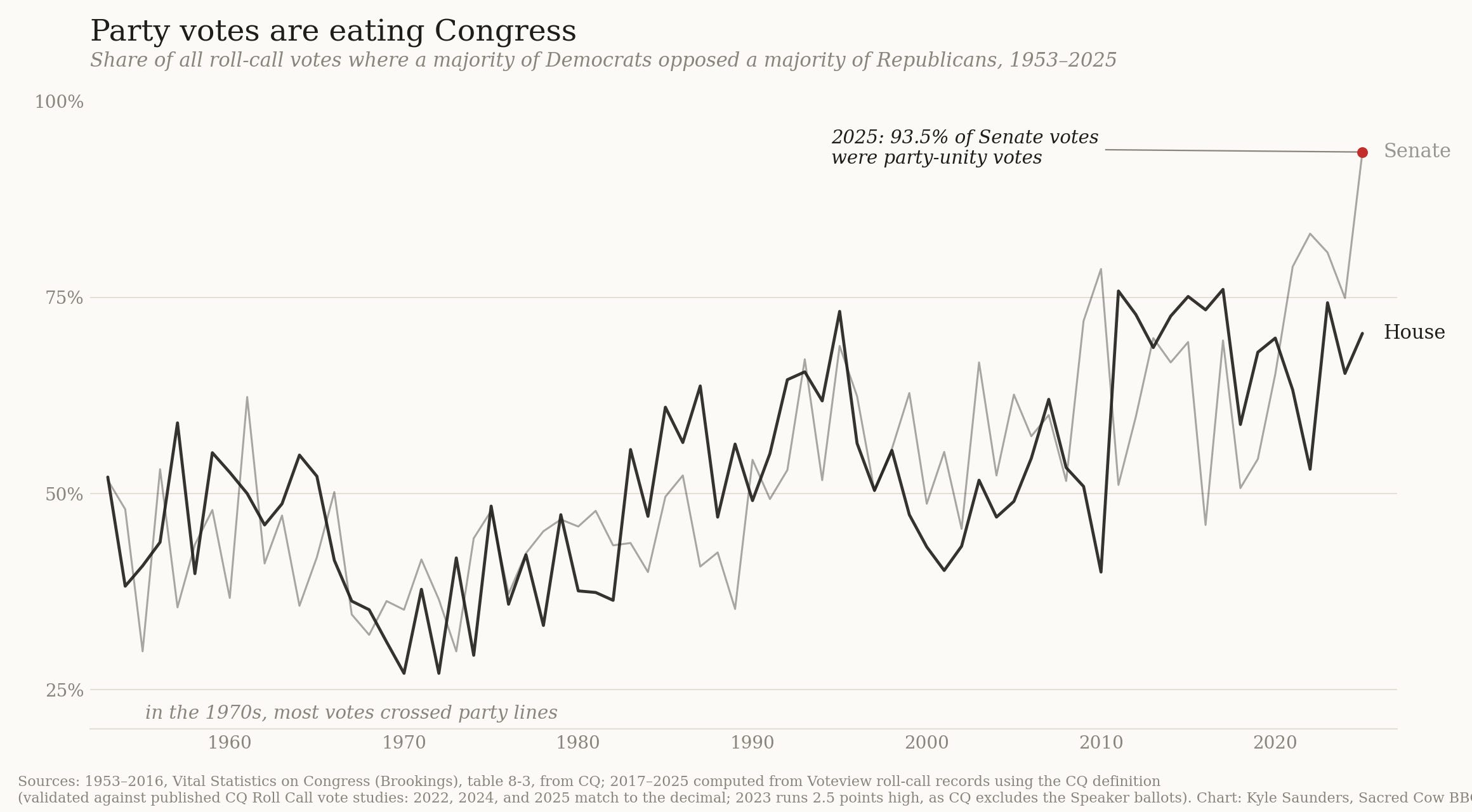
The line is the share of all roll-call votes, each year since 1953, where a majority of Democrats lined up against a majority of Republicans. The valley in the middle of the chart is the Congress your civics textbook was written about. In the 1970s, most votes crossed party lines. Cross-party coalitions weren’t a miracle; they were Tuesday. That’s the world where a college sports bill with support from 30 of 32 conferences would have been a phone call and a handshake.
The climb since then is steep and, lately, vertical. In 2025, 85.3 percent of all votes on Capitol Hill were party votes, ten points past the previous record. In the Senate alone it was 93.5 percent. Senate Republicans voted unanimously on 70 percent of those votes, and presidential support among them hit 93.7 percent, the highest ever recorded for a Republican president.
(A quick sourcing note for the data nerds: the published series runs through 2016 via Brookings’ Vital Statistics on Congress, so I computed 2017–2025 myself from the Voteview roll-call records using CQ’s definition. Three of the four years where my values can be checked against published CQ figures — 2022, 2024, 2025 — match to the decimal. The fourth, 2023, lands 2.5 points above CQ’s, almost certainly the fifteen-ballot Speaker circus, which CQ excludes and my yea/nay filter handles differently. Disclosed so you don’t have to find it. One more disclosure while I’m at it: the recorded-vote universe isn’t constant across the chart. The House barely recorded teller votes before the 1970 reforms, and the modern Senate count is inflated by cloture-plus-confirmation double-counting and three vote-a-ramas, so read the line as a trend instrument, not a precision one.)
The political science frame for that climb is Rohde’s conditional party government: when each party’s members agree with each other and disagree sharply with the other side, they hand power to their leadership and behave like teams. The condition has never been more fully met than now, because fifty years of replacement built caucuses with no internal disagreement left to manage.
But the chart and the animation together still leave a question hanging. Positions explain capacity for party warfare. They don’t fully explain the will. For that you need the electoral layer.
Nobody’s swinging
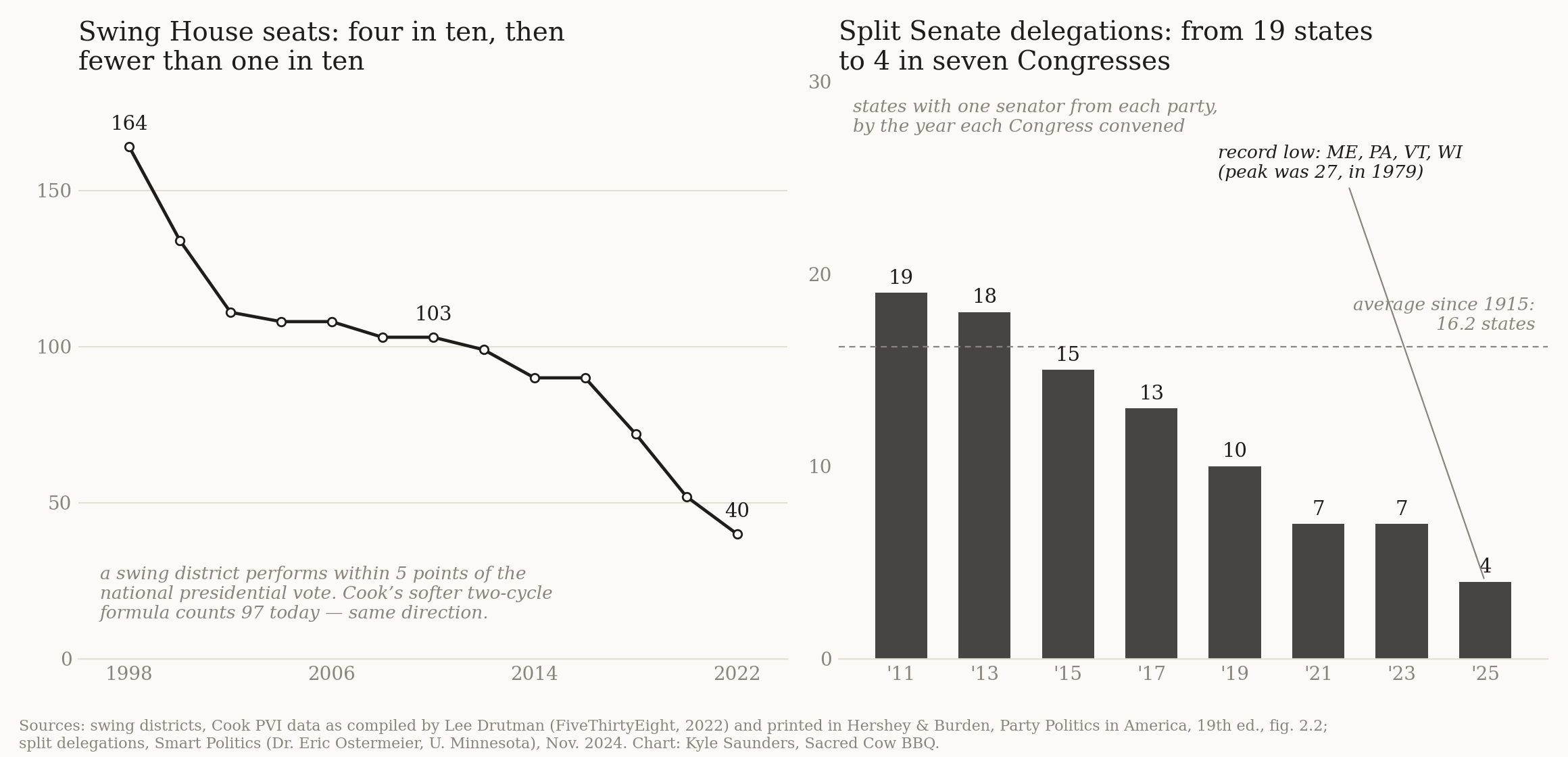
The left panel is the number of swing House districts — the ones that perform within five points of the national presidential vote, per the Cook PVI data Lee Drutman compiled for FiveThirtyEight (and which Hershey and Burden reprint in Party Politics in America, for the students reading along). In 1998 there were 164 of them, nearly four in ten seats. By 2022 there were 40.
(Definitions matter here: Cook’s current formula, which blends two presidential cycles, counts 97 swing seats for the 119th Congress — a softer yardstick, same direction, still way down from the 1990s. The stricter series is the one in the chart and in the textbook.)
Cook’s own archive work decomposes the collapse: 58 percent of it came from voters sorting themselves geographically, 42 percent from redistricting. Sorting wins, but gerrymandering is no bystander. In the districts that barely changed shape, the electorate changed underneath: rural districts got redder, urban districts got bluer, lines untouched. The median House Democrat now sits in a D+13 district; the median Republican in R+13. In 1997 that gap was 15 points. It’s 26 now.
The right panel might be more striking. In 2011 there were 19 states sending one senator from each party to Washington. Today there are four: Maine, Pennsylvania, Vermont, and Wisconsin. Four, against an average of about sixteen across the past century and a peak of 27 after the 1978 election. And the House version of the same statistic: just 16 districts in the whole country voted for one party’s presidential candidate and the other party’s House member in 2024, tying the record low.
When the general election is decided in advance, the primary is the election. The research here deserves a fair hearing, because the folklore version overshoots: incumbents almost never lose primaries, and the political scientists who’ve hunted hardest for a systematic moderation penalty in primary elections (Hirano, Snyder, and colleagues, most thoroughly) keep finding a weak one. The threat works through anticipation, not execution.
Bill Cassidy lost his primary this spring over a five-year-old impeachment vote — the first sitting Republican senator ever taken out that way, and the event was loud precisely because it’s rare. Every member of Congress watched it happen, and rational anticipation is why realized examples stay rare: you don’t get primaried for votes you never cast. The incentive structure isn’t subtle. The only voters who can realistically fire you are the ones who want you to fight harder, not compromise better, and members legislate accordingly whether or not the axe ever falls.
So the three pictures lock together into one machine, though the arrows need drawing carefully, because this is a loop, not an assembly line. Safe seats select extreme candidates (the competitiveness charts). Extreme candidates hold fixed positions for entire careers (the animation). Caucuses full of them vote as blocs and hand their leadership the whip (the party-votes chart). And nationally distinct, polarized parties then make it even easier for voters to sort themselves into safe seats, which is where we came in.
A word on which gear turns first. Morris Fiorina has argued for years that the elites polarized before the voters sorted, and the Senate is quiet evidence for him: it can’t be gerrymandered, its “districts” are whole states, and it polarized nearly as fast as the House. Whatever drives this runs on national party brands at least as much as district lines. Either way, the loop spins one direction. (Full disclosure: Alan Abramowitz and I spent the 2000s arguing the other side — our “Is Polarization a Myth?” answered its own title with a firm no, the voters are doing plenty of polarizing themselves. Fiorina was unconvinced, and said so in print, more than once. The fight outlived the decade, which I choose to read as evidence we were asking the right question.)
So, back to the PCSA for a moment, a bill with broad, almost comically lopsided interest-group support — say, 30 of 32 college sports conferences — walks into that loop and gets evaluated on exactly one criterion: which team wins the news cycle if it passes.
The PCSA memo ran on exactly this machine: the bill’s survival depends on staying coded as bipartisan in a chamber where 93.5 percent of votes weren’t. When I wrote that exemptions from the party-vote default are revocable, this post is the dataset that sentence was standing on.
So, now maybe you understand where my thinking on the PCSA comes from!
It is never ever that simple
Four honest wrinkles before the landing, because the clean story is a little too clean.
First, the symmetry the animation implies is contested. The clouds pull apart together, but they don’t pull equally. McCarty, Poole, and Rosenthal’s own measurements show the post-1980 movement is mostly the Republican cloud moving right, with the Democratic cloud drifting more slowly left (much of that driven by the changing composition of who Democrats are rather than leftward movement among incumbents). The size of that asymmetry is measure-dependent, though: donor-based scores and issue-position codings complicate the picture, and if some party-line voting is strategy rather than belief (see the next wrinkle), a voting-record ruler will read obstruction as extremity. You can argue about why and how much, and people do, loudly. But “both parties radicalized identically” isn’t what the roll-call data say.
Second, party votes measure behavior, not belief. Frances Lee's Insecure Majorities makes the uncomfortable case that a chunk of party-line voting is strategic teamsmanship rather than ideological distance: when control of Congress is permanently up for grabs (and it has been since 1980, after decades of one-party Democratic dominance), the minority's best move is to deny the majority wins, on everything, including things they privately don't mind. Some of that 85.3 percent is conviction; some is just the scoreboard.
Third, the 14.7 percent is real. Bipartisan bills still pass: defense authorizations, appropriations, the occasional real deal. That sliver is where the PCSA is trying to live. The machine still allows cooperation; it just demands that cooperation justify itself, vote by vote, against a default of war.
And fourth, for the dimension nerds: “the second dimension has collapsed” means collapsed in the votes. Leaders control the agenda, and the cross-cutting fights that could split today’s parties from the inside (trade, immigration, war powers) are the votes leaders most carefully avoid scheduling. A dimension that can’t get a roll call can’t show up in roll-call data. Less dead, maybe, than in witness protection.
The uncomfortable rhyme
The polarization tracker at the bottom of the animation has one previous peak: the Gilded Age, the 1880s and 90s, when party distance last looked like ours. People sometimes find the precedent comforting. We’ve been here before, the republic survived, the Progressive Era eventually broke the fever.
I’d hold off on the comfort, though not for the easy reason. The easy story says the 1890s had competitive elections and we don’t, and that story is half-true at best. Gilded Age competition ran substantially on patronage machines and party-printed ballots, so “they were afraid of the voters” is doing romantic work I shouldn’t let it do. And we have ferocious competition of our own: control of Congress has been up for grabs in nearly every cycle since 1980 (Lee’s whole point, two wrinkles ago).
What’s new is the configuration. The parties are collectively insecure while their members are individually safe. Permanent war for the majority gives every caucus a reason to fight everything; four split delegations and sixteen crossover districts mean almost no individual member pays a general-election price for fighting. The brake didn’t disappear. It moved to a wheel — national majority control — that doesn’t steer any particular member’s behavior, and it’s members who cast the votes.
The deliverables: the interactive animation is here, the video version is on YouTube, and both charts are free to circulate with credit/attribution.
Scrub to 1965 and watch the teal dots. Then scrub to now and count the dots in the middle. Then think about what you’d do in their seats, with their incentives. Same rule as always around here: incentives over intentions.
Data: Lewis, Poole, Rosenthal, Boche, Rudkin & Sonnet, Voteview.com; Brookings, Vital Statistics on Congress; CQ Roll Call vote studies; Cook Political Report; Smart Politics. If your textbook is Hershey and Burden’s Party Politics in America, the party-vote table in there is the printed cousin of the first chart.
If you found this helpful and you want to support my work, I hope you’ll consider a paid subscription or buy me a coffee/beer/book with a click on the graphic below.

NB: This essay is written in my capacity as a political scientist who studies institutions, incentives, and collective action, not as an institutional spokesperson.